
The 3 Marketing Collateral Mistakes That Make Prospects Lose Trust Immediately
This may come as a rude awakening, but those critical first moments when a potential client encounters your marketing materials, they're making split-second judgments about your business.
Is this company professional?
Do they know what they're doing?
Can I trust them with my money?
In a world flooded with brands competing for attention, your brochures, flyers, and presentations aren't just extras - they're doing the heavy lifting of introducing your business, building credibility, and influencing decisions.
As a freelance graphic designer with over 12 years of experience creating marketing collateral that converts, I've identified three critical design mistakes that repeatedly sabotage business marketing efforts. These trust-killing design flaws can silently undermine your marketing before you've even had a chance to make your pitch.
Let's break down these three trust killers and, more importantly, how to fix them.
Trust Killer #1: Cognitive Overwhelm from Too Much Text
We've all been there – picked up a brochure or opened a PDF that looks like someone tried to cram an entire website onto a single page. What's your immediate reaction?
If you're like most people, you put it down. Immediately.
When your prospects see a wall of text, their brain goes into cognitive overwhelm mode.
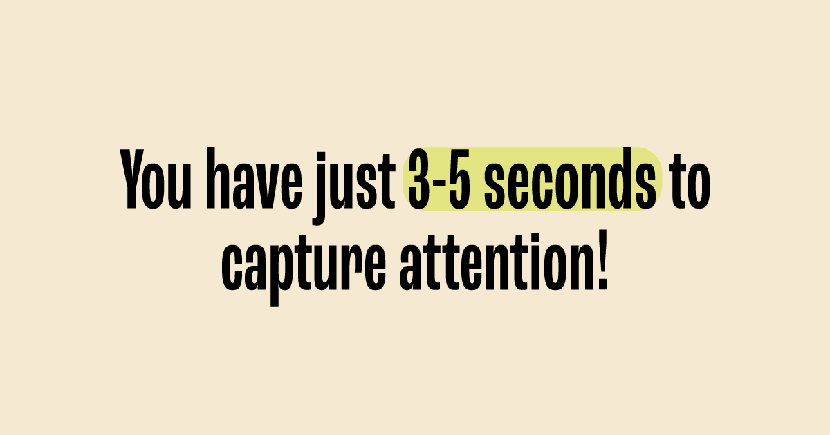
Research in consumer psychology shows you have just 3-5 seconds to capture attention before someone decides whether to engage or move on. Dense, crowded text triggers an instant dismissal. Your carefully crafted message never even gets read.
In my experience reviewing marketing materials across various industries, this is consistently the number one problem. Businesses are often so eager to communicate every benefit and feature that they forget the primary purpose of marketing collateral: to create interest, not exhaustively inform.
The solution focuses on:
Breaking content into digestible chunks
Creating a visual rhythm of text and white space
Prioritising only the most crucial information
Using visual elements to communicate complex ideas
Remember: Less text = More impact.
Trust Killer #2: Following Canva Trends Instead of Brand Guidelines
Don't get me wrong, tools like Canva can be incredibly helpful. But there's a hidden danger lurking in template-based design: inconsistency that erodes trust.
When each marketing piece follows a different template or trend rather than your established brand guidelines, you're creating a subtle but powerful disconnect in your prospect's mind.
This inconsistency manifests in several ways:
Different font combinations across materials
Shifting colour palettes that don't appeal to your target audience and create the perception your intending to
Inconsistent photography or illustration styles
In small businesses especially, I often see this "mix and match" approach to marketing materials. The website follows the brand guidelines, but social media graphics use trending templates, while printed materials adopt yet another visual language entirely.
The key to fixing this issue is straightforward:
Creating a simple, flexible template system based on your actual brand guidelines
Establishing clear rules for typography, colour, and image usage
Developing a consistent visual hierarchy across all materials
Building a small library of brand-aligned graphic elements
Remember: Consistency builds recognition, and recognition builds trust. Every piece of marketing should reinforce your brand identity, not dilute it.
Trust Killer #3: No Visual Hierarchy
When everything is emphasised, nothing is important. It’s like the saying “if everything is urgent, nothing is urgent” but for visuals.
I see his fundamental design principle is overlooked in marketing collateral all the time, creating materials where:
Headlines, body text, and captions compete for attention (*when everything is the same font size!)
Important information blends into background details
Call-to-action elements get lost in the visual noise
Readers can't quickly determine what matters most
Without clear visual hierarchy (think heading, subheading, body text and photography), prospects can't quickly understand what you offer, why it matters to them, and what action they should take next.
This confusion creates friction in the decision-making process – and when faced with friction, most prospects simply move on to options that feel clearer and more straightforward.
In my design practice, I've observed this problem across businesses of all sizes. The desire to highlight everything as "important" actually results in nothing standing out.
Effective visual hierarchy can be established by:
Creating a clear focal point with a clear heading and engaging visual
Using size, colour, and positioning to guide the eye through information
Streamlining content to support the main message
Making the call to action unmistakably clear
Remember: Your job is to guide your prospect's eye to what matters most. Make decisions for them about what deserves attention first, second, and third.
The Hidden Cost of Poor Design
The truth is, cutting corners on design can cost you more in the long run. Here's how:
Missed Opportunities: If your materials don't grab attention, potential customers will move on to a competitor who does.
Lack of Trust: Inconsistent or amateur design makes your business look unprofessional and unreliable.
Time Wasted: Struggling with DIY tools eats up hours that could be spent growing your business.
Reprint Costs: Poor design often leads to errors, reprints, and wasted resources.
Creating Marketing Collateral That Works
Good design isn't just about looking nice, it's about making your marketing work harder for your business. When I design marketing materials, I focus on three key elements:
Clarity & Consistency: Every piece of marketing collateral should reinforce your brand's message, ensuring customers instantly recognise and trust you.
Audience Connection: Effective design speaks directly to your target audience. Understanding your ideal customers means crafting visuals that resonate with them specifically.
Conversion & Impact: Design should drive action. Whether it's encouraging a sale, building credibility, or increasing engagement, every element must serve a purpose.
Don't Let Poor Design Cost You Valuable Prospects
If your marketing collateral is suffering from any of these trust killers, it's worth taking a step back to evaluate how these materials are representing your business in those critical first moments of contact.
Remember – in a world where people skim, scroll, and decide fast, your marketing collateral isn't just paperwork. It's often the first impression a potential client has of your business, and it needs to work as hard as you do.
Great design isn't an expense – it's an investment in how your business is perceived, trusted, and valued.
Ready for your marketing materials to drive action?