
Bear Pilates
Creating a Brand That Feels Like a Warm Bear Hug
The Story Begins
When Brendon first reached out to me, he had a vision that was refreshingly different from anything I'd heard in the fitness industry. He didn't want to create another sleek, intimidating boutique studio. Instead, he wanted to build something that felt like home – a place where his clients could retreat and emerge feeling stronger, not just physically, but emotionally.
"I just wanted something different, strong and warm," he told me during our initial conversation. "I might have also drawn inspiration from the name from the TV show The Bear and Jeremy Allen White.”
But as we dug deeper into his brand questionnaire, I realised there was so much more to this story.


Uncovering the Real Problem
Through our discovery process, Brendon painted a picture that hit me right in the heart. His target clients – young mothers and female professionals aged 25-55. An audience that often has feelings that sound like….
"I don't feel pretty enough for those studios."
"Reformer Pilates seems so overwhelming."
"I don't have time, and I don't know where to start."
These weren't just business insights – they were human truths. Women were avoiding taking care of themselves because the fitness industry had made them feel like they didn’t belong.
Brendon's vision became crystal clear: "To create a community where clients can retreat. A safe Pilates space where clients can build strength, stability and confidence in the bear cave."
That phrase – "the bear cave" – would become the foundation of everything we built together.
Finding Our North Star
As I worked through Brendon's responses, three core values emerged that would guide every design decision:
Compassion – "Allowing everyone to participate, regardless of their age, gender, race and fitness background."
Honesty – "Being completely honest with staff and clients about what we provide and who we are."
Integration – "Using movement to complement the rest of our clients' lives. Making movement a part of life."
But the moment that really captured my heart was when Brendon described how he wanted his clients to feel: "Like they are getting a hug from a grizzly bear."
Strong. Safe. Warm. Powerful yet nurturing.
I knew exactly what we needed to create.

Bringing the Bear to Life
The logo concept came together like pieces of a puzzle. I needed to create something that was:
Instantly recognisable as a bear
Connected to Pilates and movement
Simple enough to work everywhere
Warm and approachable, not intimidating
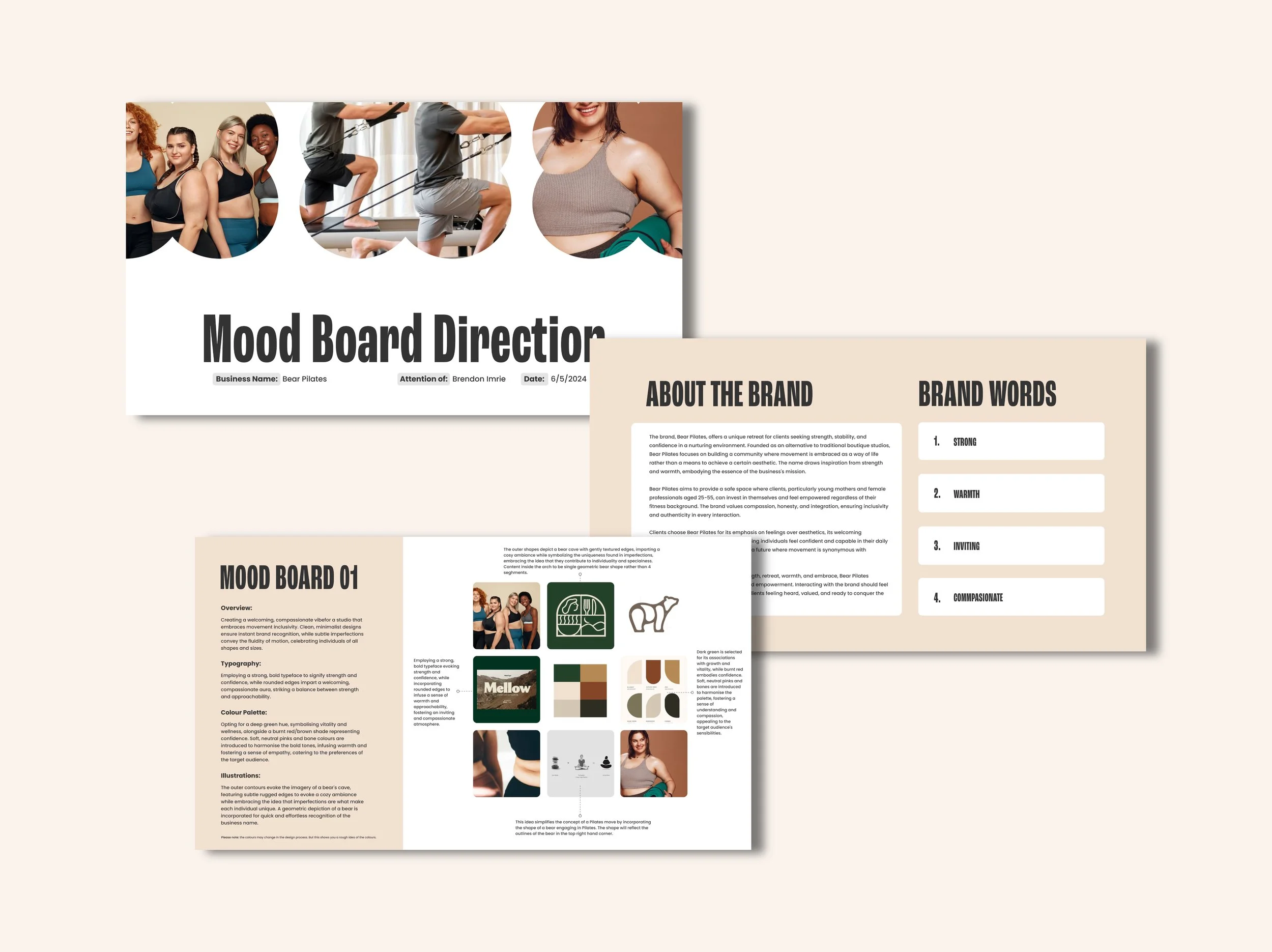
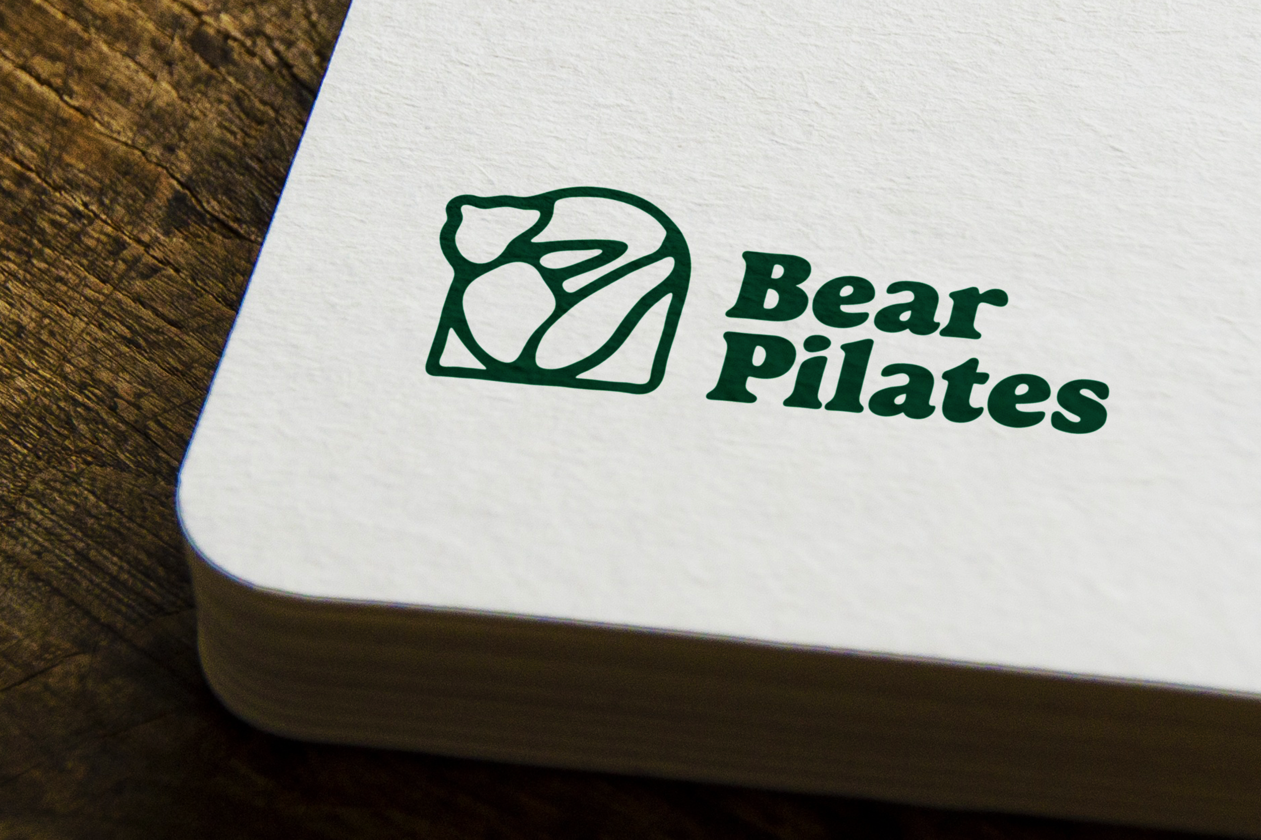
The solution? A geometric bear silhouette captured mid-Pilates move, nestled within a rounded square frame that represented the "bear cave." But here's the key detail that made it special – those edges aren't perfectly smooth. They have subtle, organic imperfections that celebrate the uniqueness of every body and every journey.
The Strategic Decisions

Colour Psychology in Action
Every colour in our palette was chosen with intention:
Forest Green became our primary – it's the colour of growth, of nature, of that grounding feeling you get when you step into the woods. It says, "this is where you belong."
Clay Red adds warmth and confidence. It's earthy like bear fur, strong but not aggressive.
Bone and Soft Pink soften the palette, making it accessible and welcoming. These aren't the stark whites and greys of intimidating fitness brands – they're warm, lived-in colours that feel like home.

Typography That Tells a Story
For the main logo type, I chose Calistoga – a serif font with personality. It's strong and confident, but has these beautiful rounded edges that make it feel approachable. It's like Brendon himself – powerful but warm.
For everything else, Poppins became our workhorse. It's clean and modern but has those same rounded qualities that make reading feel friendly, even on mobile screens where space is tight.
The Moment It All Clicked
When I presented the final logo to Brendon, something magical happened. It wasn't just a logo anymore – it was the visual embodiment of his vision.
The geometric bear wasn't just an icon; it was every client who had ever felt intimidated by fitness, now finding their strength. The imperfect edges weren't design flaws; they were celebrations of authenticity. The cave-like frame wasn't just a container; it was a promise of safety and belonging.

Building a Brand System That Works
With the core identity locked in, we built out a complete brand system designed for real-world use:
Three Logo Variations
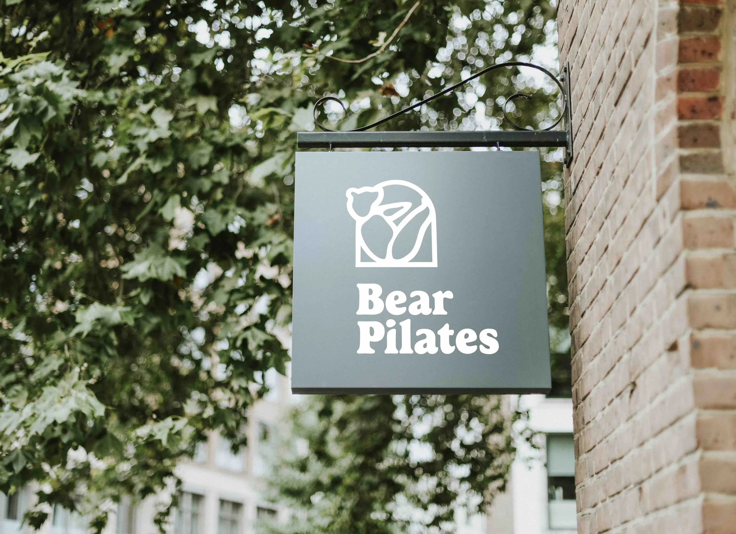
Because Bear Pilates needed to work everywhere – from Instagram posts to storefront signage – we created primary, secondary, and submark versions. Each one tells the same story but adapts to different spaces and needs.
Primary Logo
Secondary Logo
Logo Mark
Clear Guidelines
I made sure Brendon (and anyone who works with the brand in the future) would never have to guess. The brand guidelines spell out exactly how to use every element, what not to do, and why each decision matters.
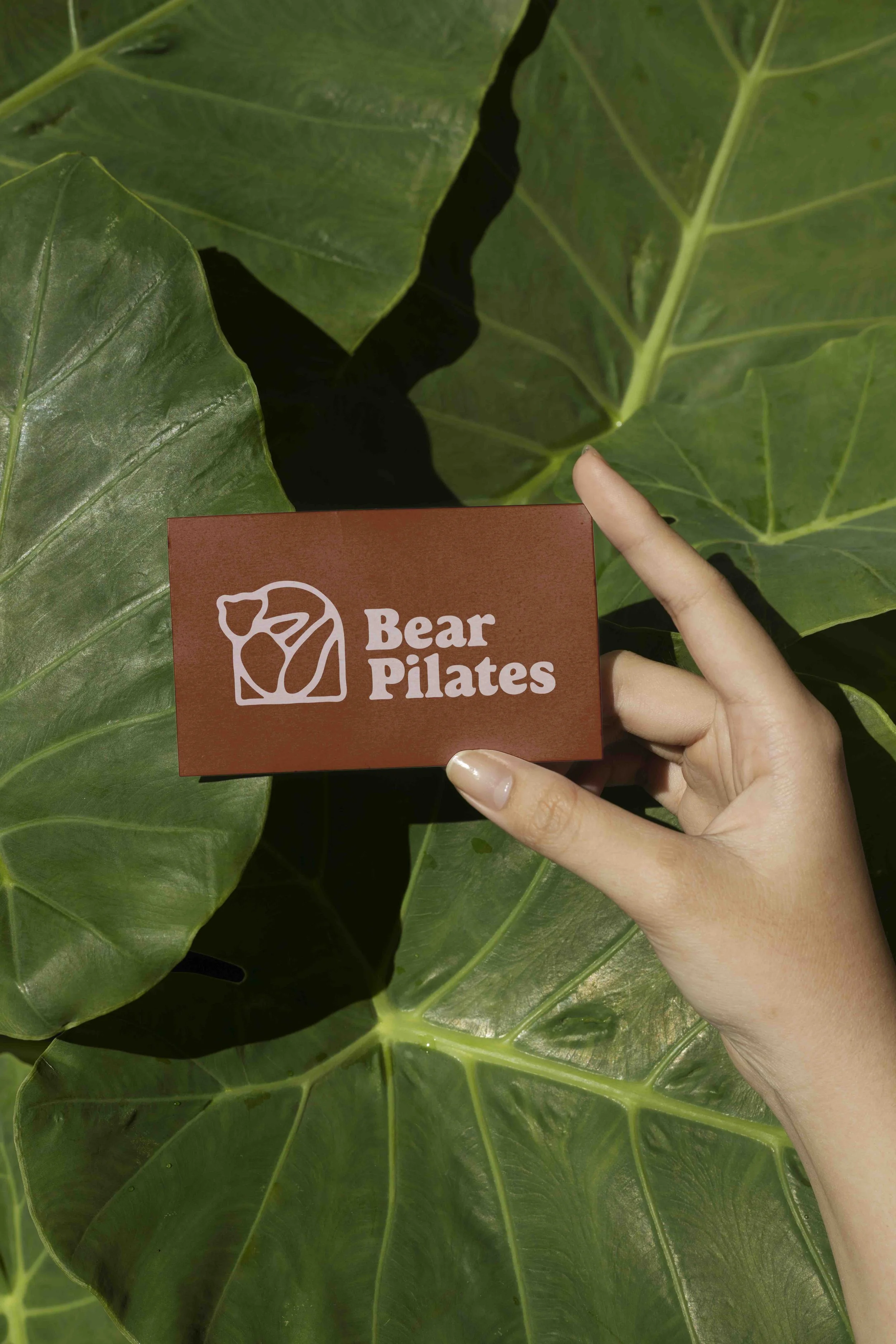
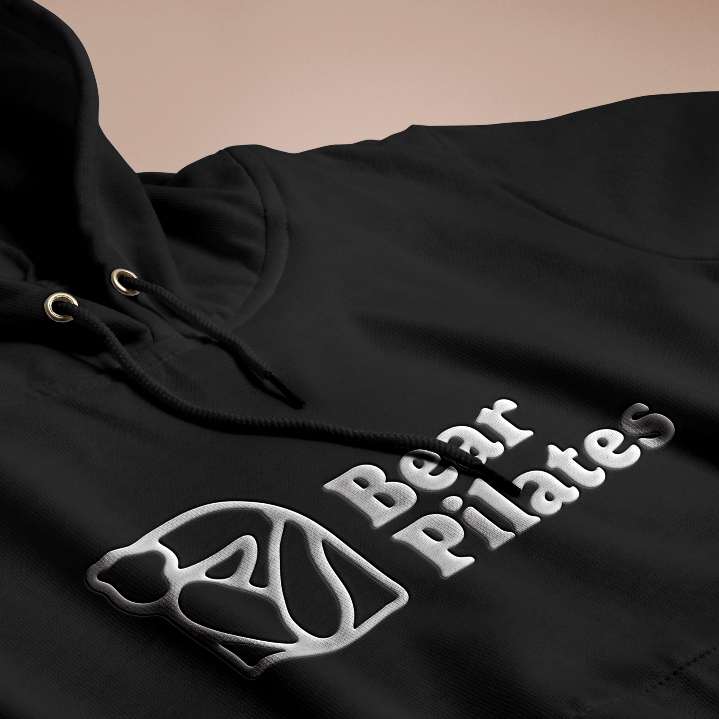
Flexible Application
From business cards that feel warm in your hand to social media posts that stop the scroll, every touchpoint reinforces that same feeling: You belong here. You are enough. This is your safe space to grow stronger.


Ready to promote your business with confidence?
Ready to feel confident promoting your business, knowing your materials truly represent your expertise?
Let’s work together to create a brand or marketing assets that are not just visually stunning but also effective in attracting new customers and building trust.