
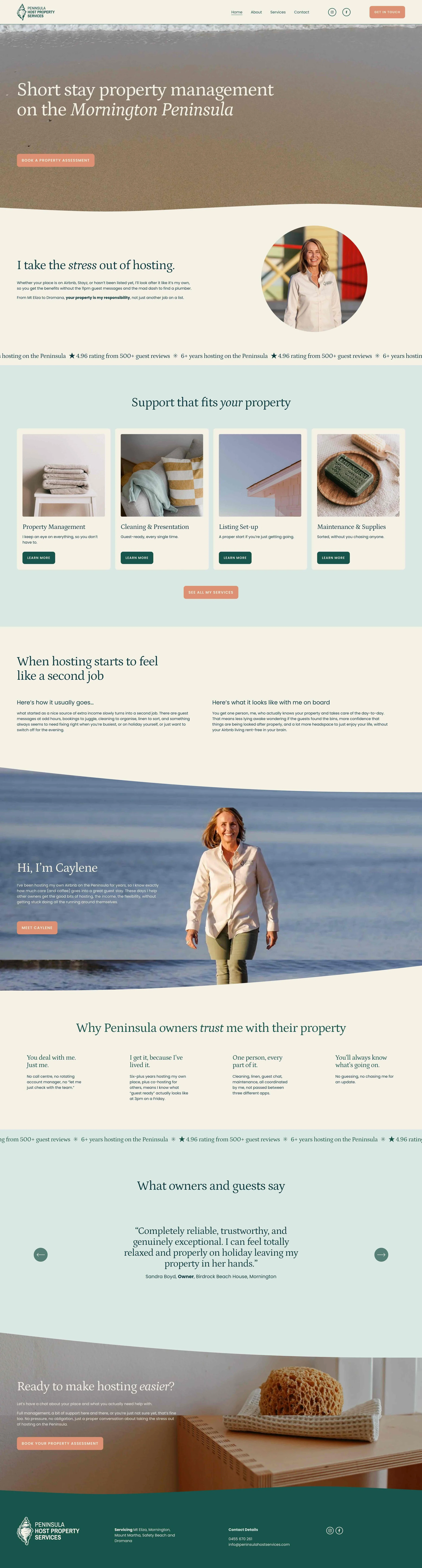
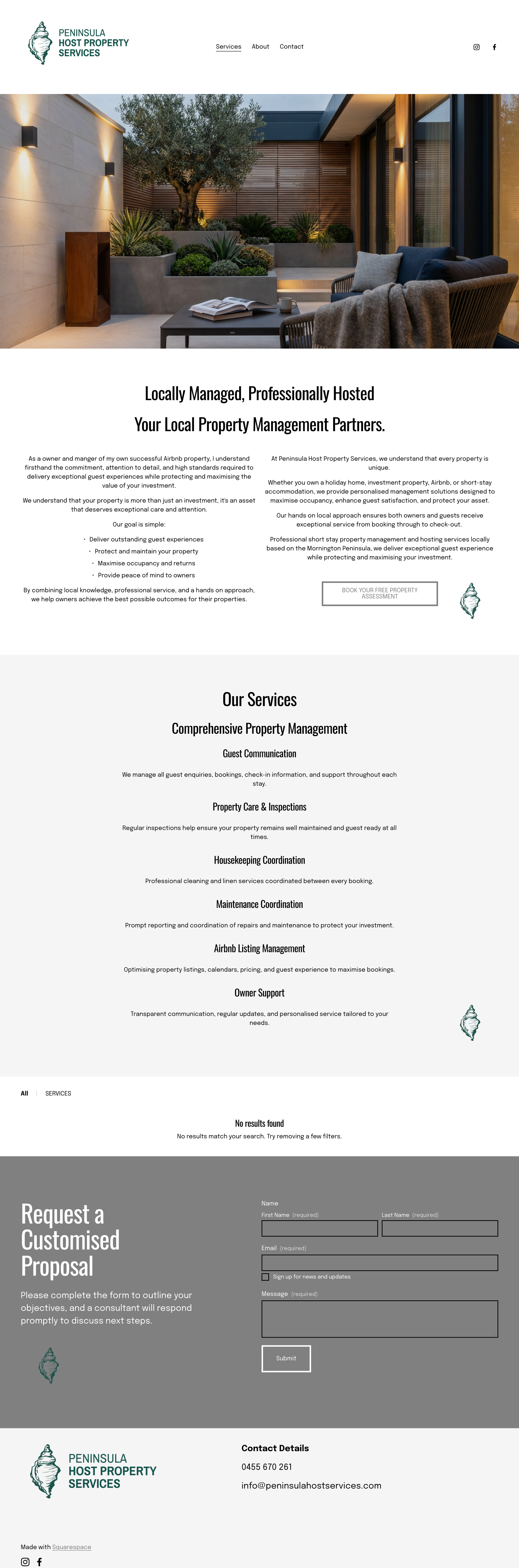
 Before
After
Before
After
Peninsula Host Property Services
The brief
Caylene came to me with a website already live, built on a generic Squarespace template. It had her logo on it, but it didnt feel like her. The layout wasn't built around how people actually search for local Airbnb management, and the visual presentation didn't reflect her brand, her personality, or what set her apart from the bigger players already dominating the Mornington Peninsula market. My job was to turn that template into a considered, SEO-ready brand presence that actually sounded and looked like Caylene.
Services provided
Brand Strategy & Competitor Analysis
Messaging, Tone of Voice & Brand Styleguide
Website Copywriting & SEO
Where Caylene started
Caylene came to me with a website she'd built herself on a DIY template. It had her logo at the top and bottom, but beyond that, nothing really said who she was. The colours were plain black and white, stark and clinical. The fonts were big and bold. And the page was mostly just blocks of text, no clear sections, nothing to help a visitor quickly find what they needed.
None of it reflected the person behind the business, someone warm, personal and genuinely easy to deal with.
What this was actually costing her
Here's the part most business owners don't realise: when someone lands on your website, they decide whether to stay or leave within a few seconds, and they rarely know why they left. They just feel like it's "not quite right," and click away to the next option.
A harsh colour palette can make a warm, friendly business feel cold and corporate before anyone's read a word. A page with no clear structure forces people to work hard just to figure out what you do, and most people won't bother. They'll simply leave, and go find someone whose website made that easy for them. Caylene wasn't losing visitors because her business wasn't good. She was losing them because her website wasn't showing them that.
Where we started: understanding the market
Before any design work, I looked closely at Caylene's biggest competitors on the Mornington Peninsula, bigger companies with teams behind them. I found the one thing none of them offered: a single, real person a property owner could actually get to know and trust. That became the heart of Caylene's brand, and the reason someone should choose her over a bigger, more anonymous company.
Building more than a logo
A logo is a small piece of a brand. On a website, it usually just sits in the corner. It's everything else, the colours, the fonts, how the page is laid out, that actually tells people who you are and how dealing with you will feel.
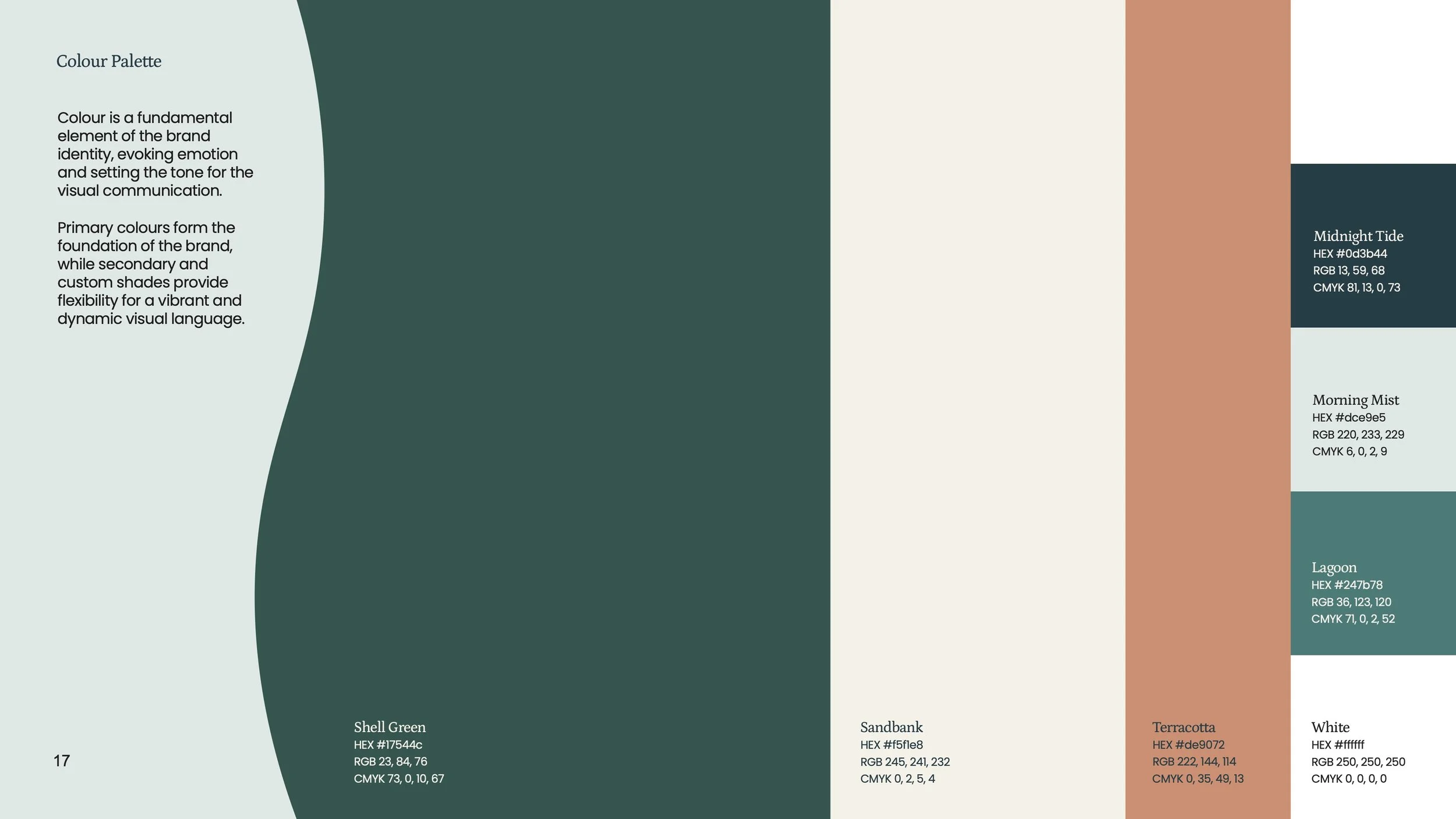
So rather than just keeping Caylene's existing logo and leaving everything else to chance, I built her a complete visual identity around it, warm, coastal colours and fonts chosen to actually feel like her, nothing like the stark black-and-white template she'd had before.
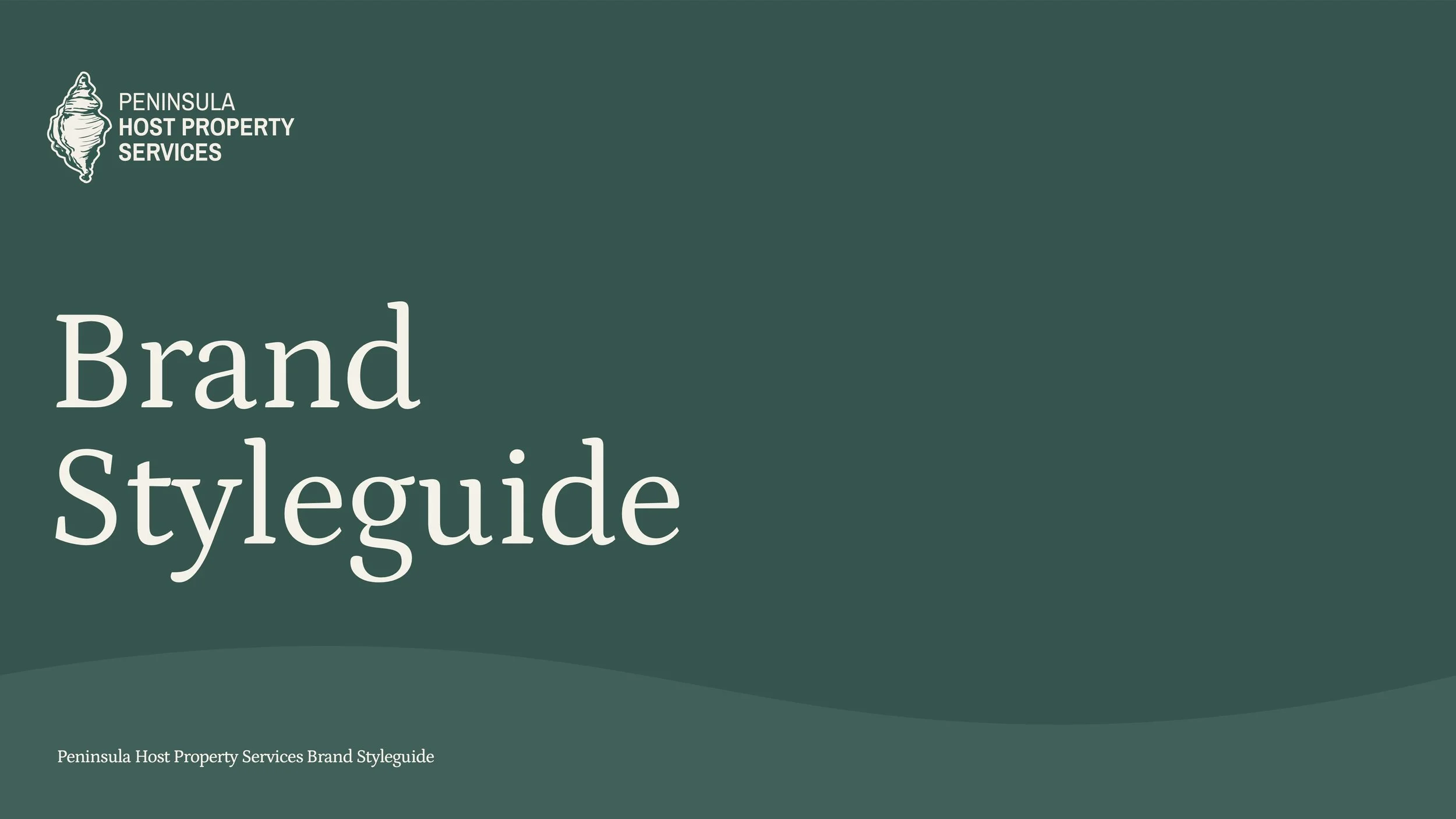
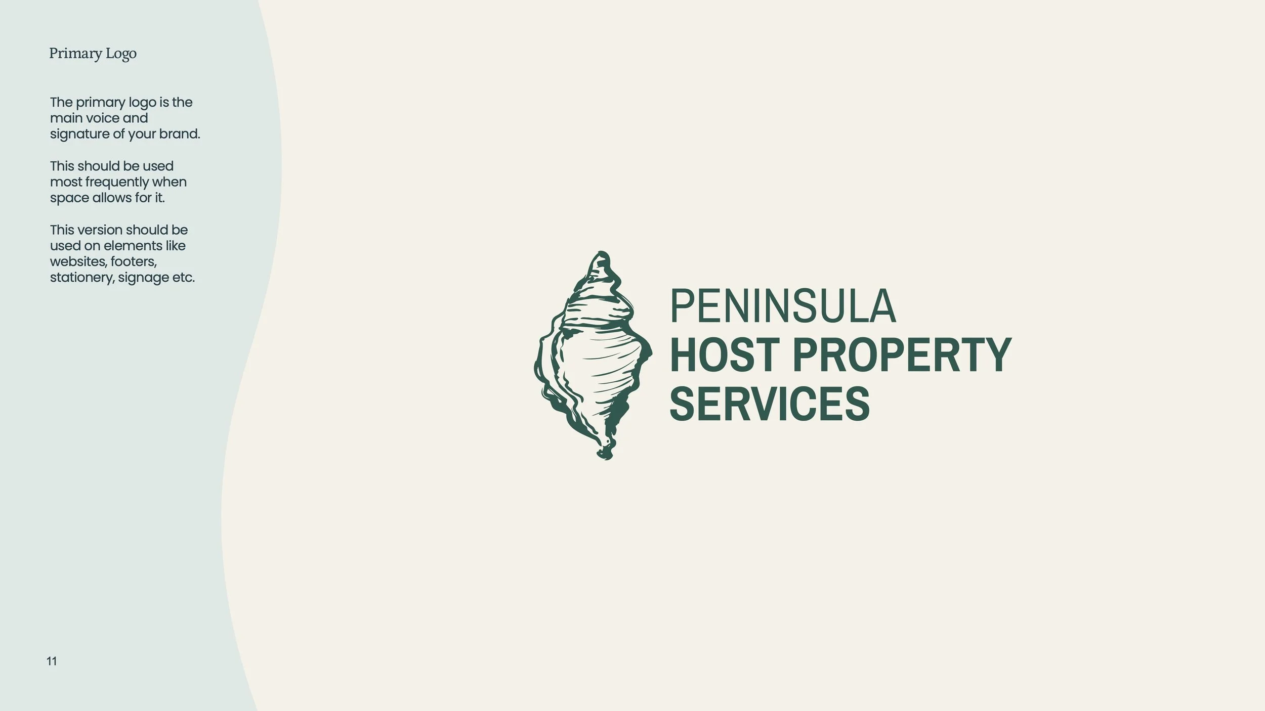
A brand styleguide she can use for life
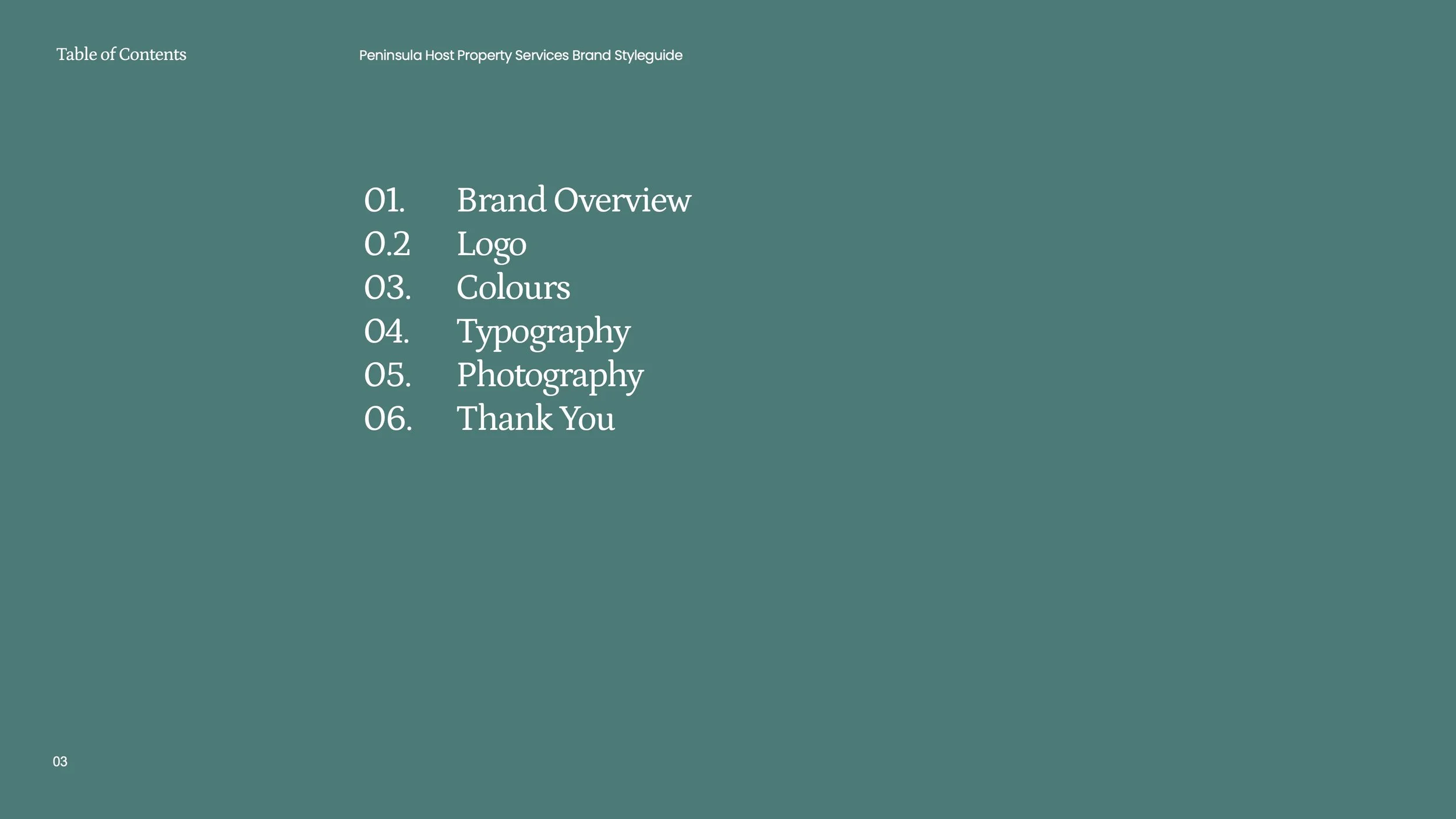
That visual identity didn't just go onto the website and stop there. I put it all together into a full Brand Styleguide, a document Caylene now owns and can refer back to any time. It covers her colours, her fonts, her tone of voice, even guidance on the style of photography that suits her brand.
It means Caylene isn't starting from scratch every time she needs something new, a social media post, a flyer, business cards, signage. She can hand this guide straight to a photographer, a printer, or any future supplier, and know exactly what she'll get back will look and feel consistently like her brand, every single time.
Turning that into a website that works
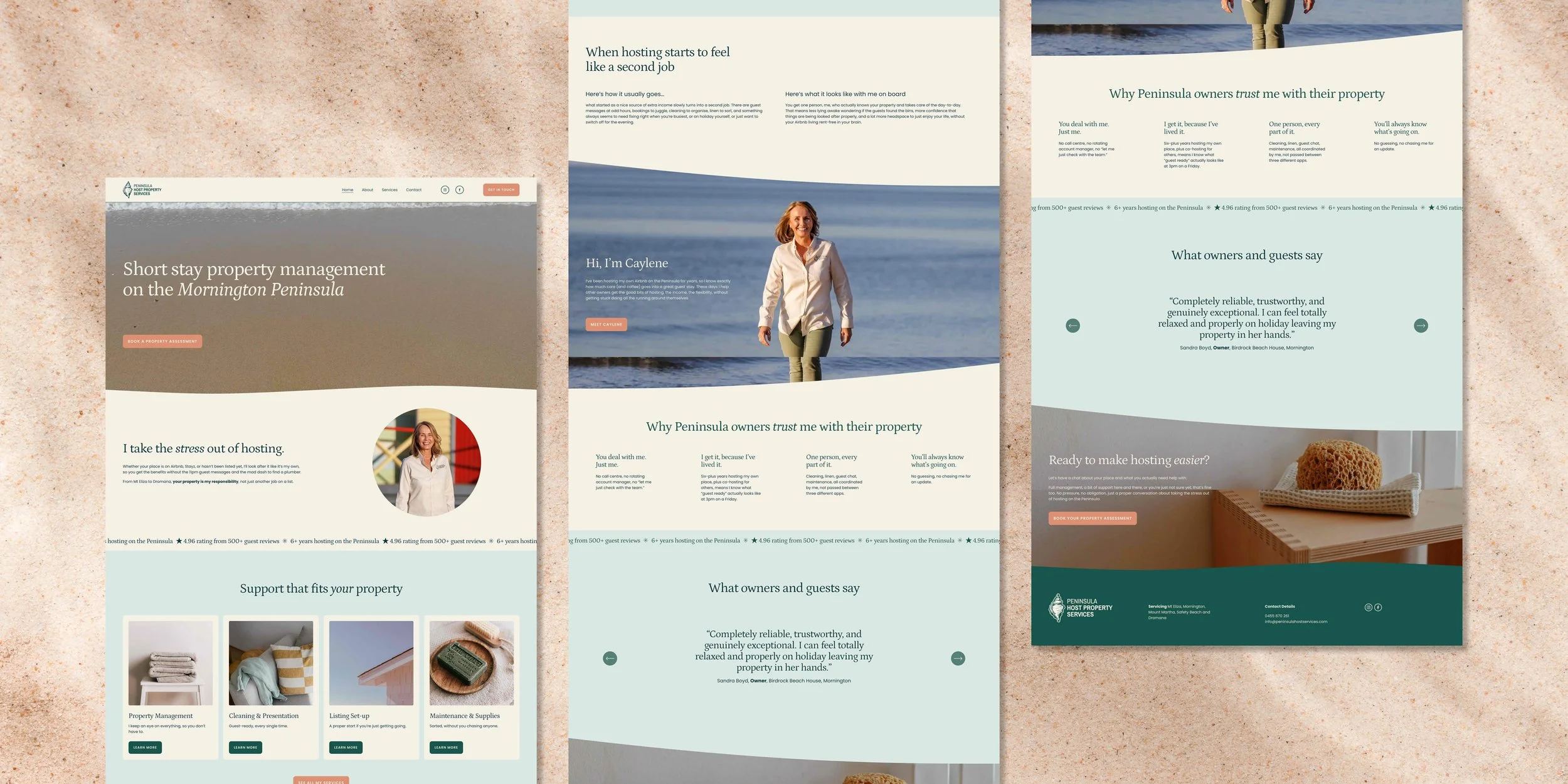
With the new colours and fonts in place, I rebuilt the website so it was broken into clear sections with proper headings, easy to skim, easy to understand, and nowhere near as overwhelming as the old page of dense text. A visitor can now glance at the site and immediately know who Caylene is, what she offers, and what to do next.
I also rewrote every single word of the copy myself, in Caylene's own voice, so it sounds like a real person talking, not a brochure. And I made sure it was written in a way that search engines like Google can actually understand and recommend to the right people searching for help on the Peninsula, something her old DIY site was never set up to do.


The Result
Caylene didn't just end up with a website that works. She now has a complete visual identity, a Brand Styleguide she can use for years to come, and a website that actually looks and sounds like her, instead of working against her. It's easy for visitors to understand at a glance, easy to navigate, built to be found by the right people searching in her area, and it's all backed by a brand system she can confidently hand to anyone she works with in future.
Ready to promote your business with confidence?

Ready to feel confident promoting your business, knowing your materials truly represent your expertise?
Let’s work together to create a brand or marketing assets that are not just visually stunning but also effective in attracting new customers and building trust.