

ISS Frontline Leadership Initiative
Sub-brand identity | Naming | Visual Strategy
Overview
ISS engaged me to develop a new sub-brand identity to support the evolution of their frontline leadership programs across Australia and New Zealand. The initiative required a strategic visual direction that felt clearly endorsed by the global ISS brand, while establishing its own presence within the organisation.
The goal was to create an identity that would unify training, communications and program materials — strengthening visibility, improving engagement and positioning leadership development as a supported and accessible pathway.
The Challenge
Many high-performing frontline employees were stepping into leadership roles without structured support or clear development pathways. Existing programs carried legacy perceptions, and the organisation needed a modern identity that signalled progress without disconnecting from the trusted ISS brand.
The challenge was to strike a careful balance: create something distinctive enough to represent a new direction, yet aligned enough to feel credible and immediately recognisable internally.
The Strategy
The approach centred on building an identity that communicated confidence, readiness and forward momentum — without relying on hierarchical or overly corporate visual cues.
A key consideration was ensuring the brand felt grounded and practical, reflecting the real environments frontline leaders operate within every day.
The identity was designed to:
Align closely with ISS’ established brand system
Introduce a modern, future-focused visual language
Reinforce leadership as a supported journey
Create consistency across digital and physical touchpoints
Provide flexibility for future program growth
Naming Direction
The name Ready to Lead was developed to communicate preparedness and capability — positioning leadership as something individuals are equipped for, not something they navigate alone.
It signals confidence without authority, and progress without hierarchy.
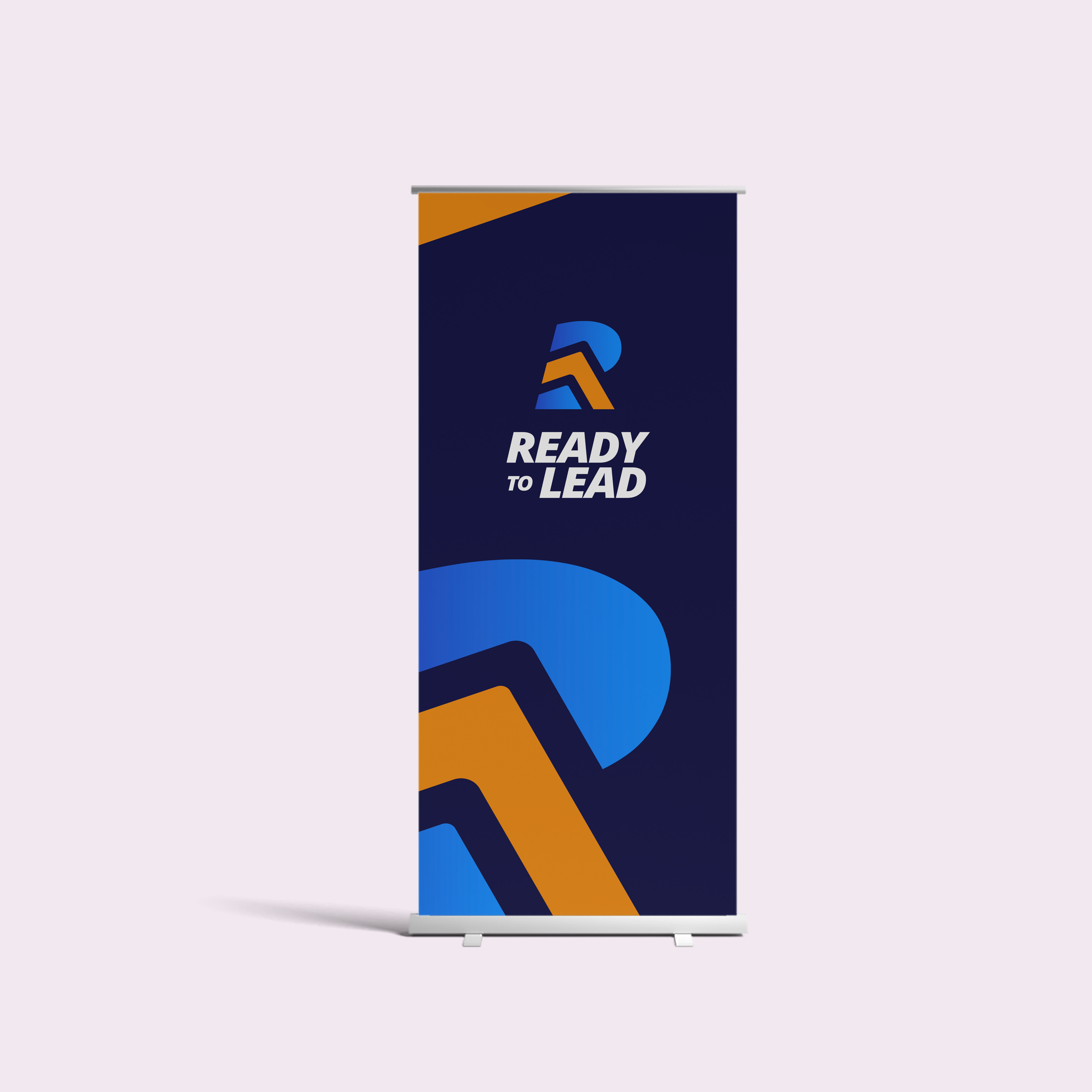
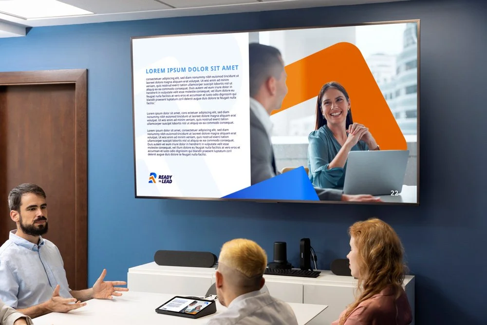
Visual Identity
The logo draws directly from the ISS typographic style, ensuring immediate brand recognition while introducing a sense of movement and evolution.
A capital R set on an italic shear creates forward momentum, while segmented elements form an upward gesture — subtly representing growth and progression.
The colour palette builds on ISS blues to retain trust and credibility, complemented by a vibrant orange accent that introduces energy, optimism and momentum. Together, the colours balance stability with progress.
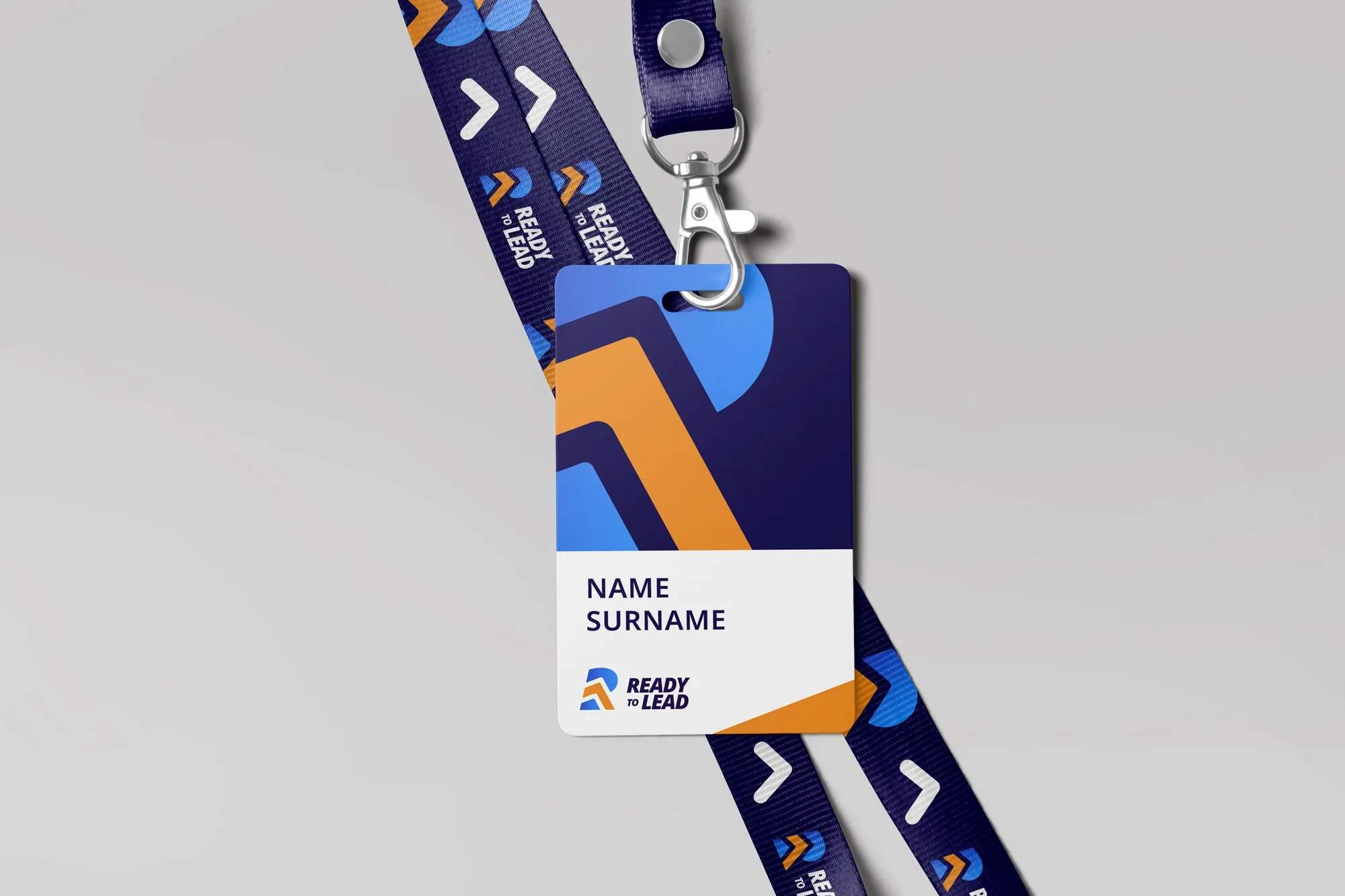
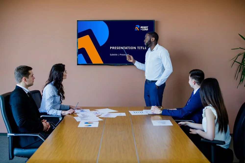
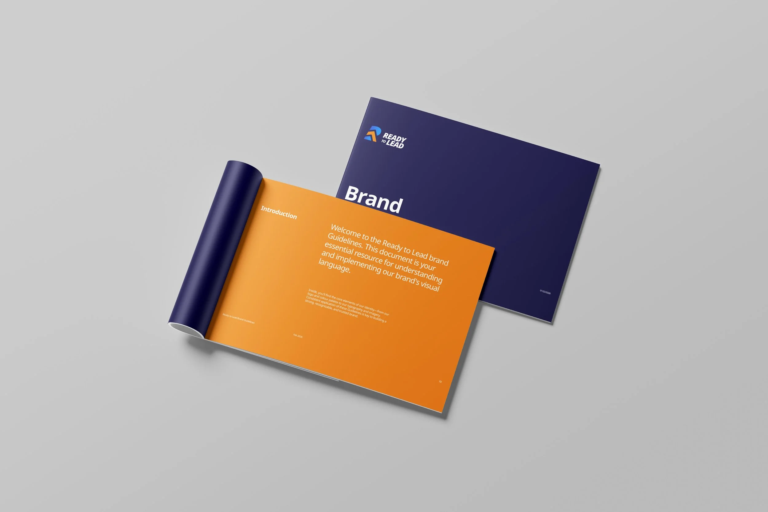
Supporting Brand Elements
Beyond the logo, a flexible visual system was developed to support rollout across training materials, internal communications and digital platforms.
This included:
A refined colour hierarchy
Typography guidance
Iconography style
Photography direction grounded in real ISS environments
Sub-brand usage rules
Mockups demonstrating real-world application
Each element was designed to ensure the identity could scale confidently as the initiative evolves.
The Outcome
The result is a confident, future-ready sub-brand that sits naturally within the ISS ecosystem while signalling a clear step forward for leadership development.
It provides the organisation with a cohesive platform to support frontline leaders — strengthening visibility, encouraging participation and reinforcing ISS’ commitment to becoming a leading frontline employer.

Ready to promote your business with confidence?
Ready to feel confident promoting your business, knowing your materials truly represent your expertise?
Let’s work together to create a brand or marketing assets that are not just visually stunning but also effective in attracting new customers and building trust.