


ISS Impact Foundation
Sub-brand identity | Visual Strategy
Overview
The ISS Impact Foundation was created to bring structure, visibility, and long-term focus to ISS’s commitment to supporting people, strengthening communities, and driving meaningful social impact. I was engaged to develop a strategic visual identity that would confidently sit within the ISS ecosystem while establishing a distinct and recognisable presence.

The Objective
Design a brand identity that feels calm, credible, and people-led — balancing professionalism with warmth — while ensuring the Foundation could operate seamlessly across corporate, operational, healthcare, and Defence environments.
The identity needed to communicate impact through clarity and restraint, allowing real stories, outcomes, and people to take centre stage.
The Strategy
The approach focused on creating a brand that belonged to ISS without mirroring it visually. Instead of relying on overt symbolism, the strategy leaned into subtle, purposeful design decisions that signal trust, longevity, and authenticity.
A refined typographic system, structured layouts, and a considered colour palette were developed to create consistency across touchpoints, while supporting a flexible brand that can evolve alongside the Foundation’s future initiatives.
The Creative Direction
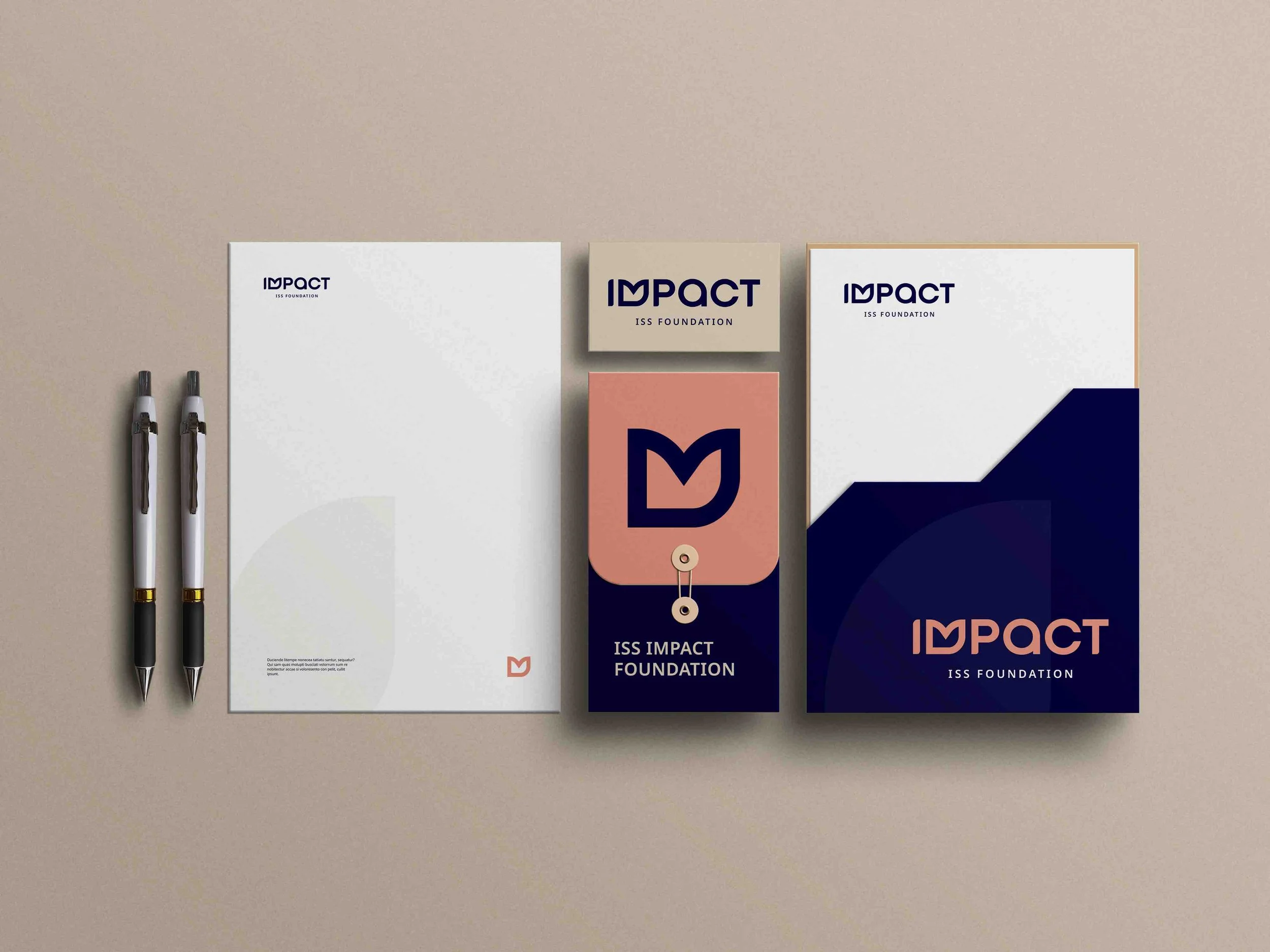
The final identity centres around a custom wordmark designed to express unity, growth, and meaningful change.
A distinctive “M” has been crafted to form an abstract heart and leaf shape — symbolising care, progress, and the Foundation’s commitment to creating positive, people-led impact. The softened curves introduce warmth and humanity, while the structured letterforms maintain a strong sense of credibility.
The mixed uppercase and lowercase typography reflects individuals from diverse backgrounds coming together, reinforcing the Foundation’s inclusive and collective purpose.
The result is a visual language that feels modern, grounded, and quietly confident — prioritising clarity and longevity over passing design trends.
Visual Identity Highlights
Custom logo and wordmark
Strategic brand positioning
Colour palette aligned to the ISS parent brand
Refined typographic system
Graphic device development
Layout principles for clarity and scalability
Brand guidelines to support consistent rollout



Supporting Brand Elements
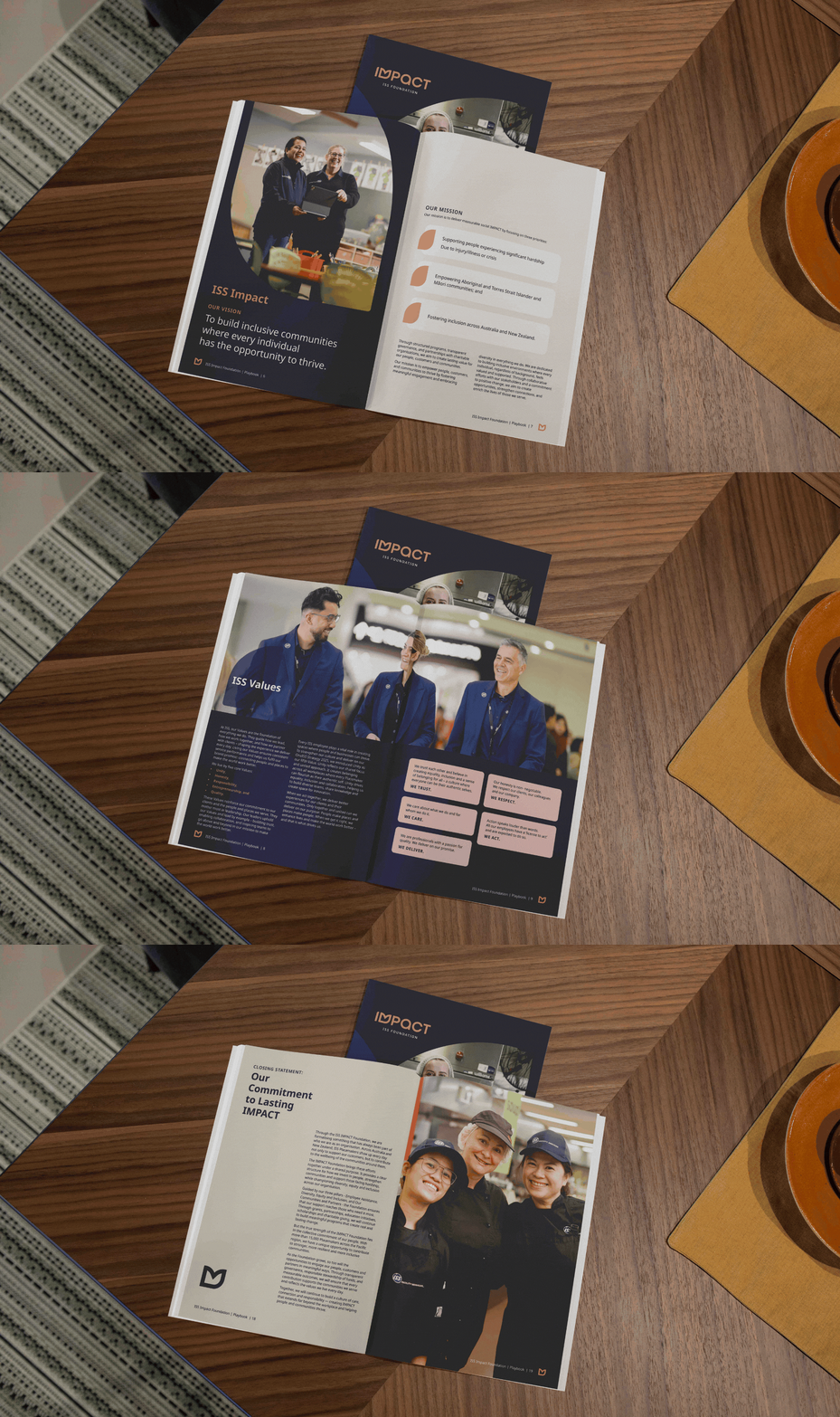
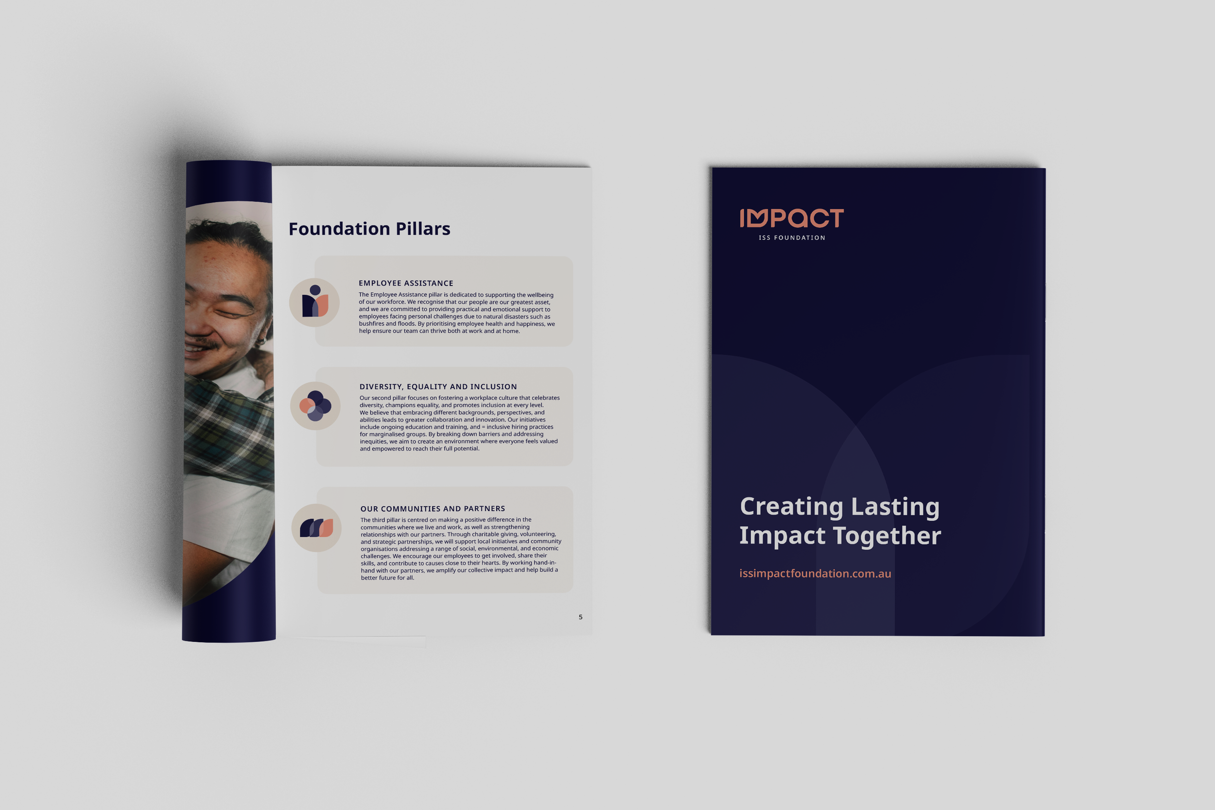
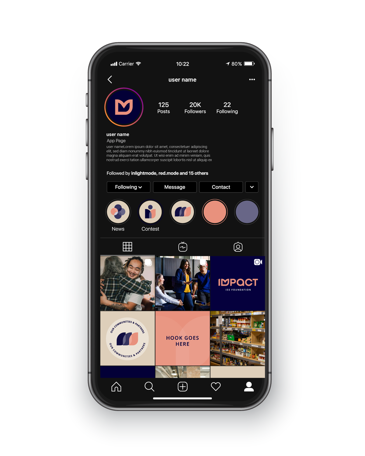
Beyond the logo, a flexible visual system was developed to support rollout across training materials, internal communications and digital platforms.
This included:
A refined colour palette
Typography guidance
Supporting brand icons
Photography direction grounded in real ISS environments
Sub-brand usage rules
Mockups demonstrating real-world application
Each element was designed to ensure the identity could scale confidently as the initiative evolves.
The Outcome
The ISS Impact Foundation now has a brand that reflects the scale, integrity, and purpose of its work — one that communicates credibility while creating space for human stories to lead.
Built for flexibility and long-term growth, the identity provides a strong platform for the Foundation to show up with confidence and continue delivering meaningful impact across the communities it serves.
Ready to promote your business with confidence?

Ready to feel confident promoting your business, knowing your brand truly represent your expertise?
Let’s work together to create a brand or marketing assets that are not just visually stunning but also effective in attracting new customers and building trust.