
Probiotica Newletter
Yakult Australia
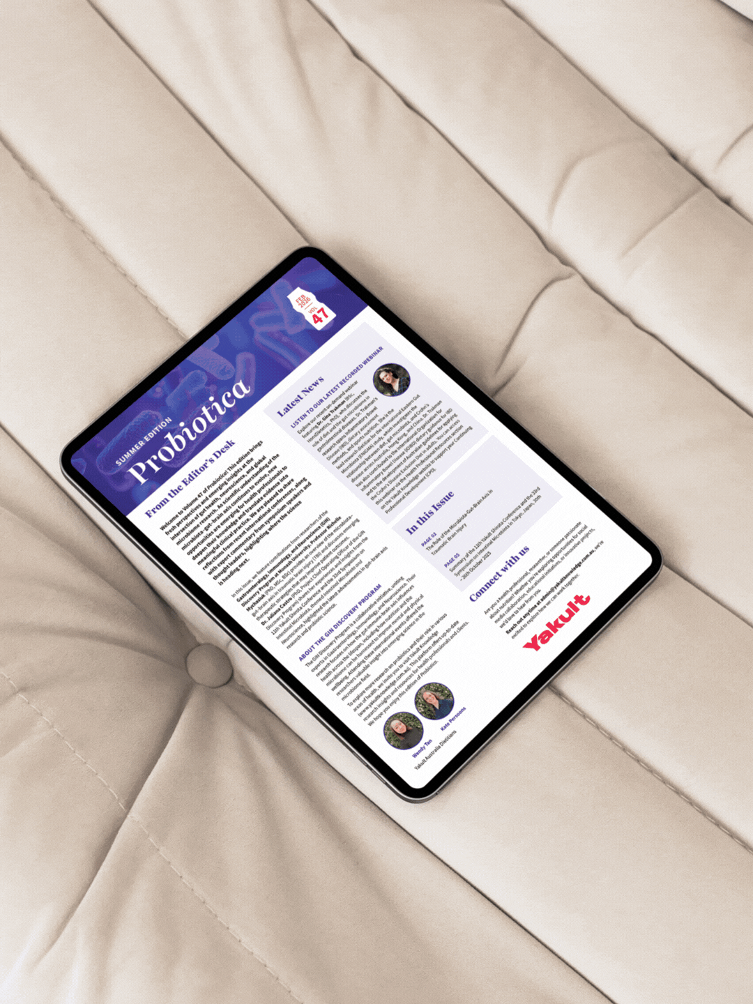
Overview
Designing an editorial publication that prioritises readability over aesthetics.
Yakult Australia produces Probiotica, a newsletter created to share updates, research and industry insights with their professional network.
Each issue contains a significant amount of editorial content, making clarity and structure essential. The challenge was not simply designing an attractive publication, but ensuring that a large volume of information could be delivered in a way that readers could easily absorb.
While many businesses focus heavily on aesthetics, readability is actually more important. It doesn’t matter how polished a layout looks — if the messaging is difficult to digest or causes cognitive overload, the content simply won’t be read.
By applying strategic editorial design principles, the layout was structured to guide readers through the content in a clear and accessible way, ensuring the message remains the focus.
Services provided
Editorial layout design, publication design for print and web formats.
The Challenge
Working with large volumes of text while keeping the content clear and digestible.
The newsletter needed to accommodate extensive written content, updates and announcements within a limited page space. Without careful layout planning, this type of content can quickly become overwhelming for readers.
The design needed to strike the right balance between including all necessary information while maintaining a layout that felt approachable, organised and easy to navigate.
The Strategy
Design decisions guided by readability and information hierarchy.
Rather than approaching the design purely from an aesthetic perspective, the layout was developed using editorial design principles that prioritise clarity and reader experience.
Key strategies included:
• Limiting line length to approximately 12 words per line to improve reading comfort
• Structuring pages into two-column layouts rather than long full-width text blocks
• Using clear headings and subheadings to allow readers to easily scan content
• Introducing images and graphic elements to break up large sections of text
• Ensuring the design translated effectively across both print and digital formats
These decisions are not simply visual choices — they are strategic techniques that help readers process information more easily.
The Outcome
A structured publication that makes complex information easier to engage with.
The final design transforms a text-heavy newsletter into a clear and reader-friendly publication that works seamlessly across both print and web formats.
By prioritising readability and thoughtful information hierarchy, the design helps ensure the content is accessible, digestible and engaging for the audience.
Because good design isn’t just about making something look good.
It’s about making sure the message is actually understood.

Ready to promote your business with confidence?
Ready to feel confident promoting your business, knowing your materials truly represent your expertise?
Let’s work together to create a brand or marketing assets that are not just visually stunning but also effective in attracting new customers and building trust.